Responsive Templates
What Are Responsive Website Templates? When we talk about responsive website templates we mean that the layout is developed with a fluid layout to respond to the current device be it a smartphone, tablet pc, netbook, laptop or desktop monitor being used to view your website.
We using a Cascading Style Sheet (CSS) to change the website template appearance for the current device that is being used.
So if a somebody is currently viewing your website using a smartphone, the CSS uses a preset styling for that device referred to as a “viewport”.
Tablet PC’s (touch pads) have become increasingly popular over the last few years due mainly to devices like the iPad or Kindle. Touch pads, like a variety of smartphones not only have a Portrait view, they also have a Landscape view.
Landscape and Portrait views are two different sizes, the “iPad” portrait size is 768px × 1024px whereas its landscape size is 1024px × 768px. Which means the design must fit in both dimensions and work properly.
For example lets take three people looking at your website:
- Normal desktop PC with a monitor that has a resolution of 1200px
- Kindle touchpad / tablet in portrait view (600px × 1024px)
- Android smartphone in portrait view (295px × 515px)
So, now what – we need to cater for all of these users with all of these different viewport sizes, no problem, with the help of CSS and our knowledge of styling we can create a website that responds to each device so your site will be fully usable in all devices.
But in every business presentation you have to have a small trade off for historic devices. Not everybody changes their device yearly, to stay up with changing technology. The same is true for desktop browsers I.E. Internet Explorer 5,6,7 are a designers nightmare thank fully not yours. So there is no one size fits all solution at this present moment for fully responsive layouts that fit on every device, and the device market is constantly changing. But we can cater for 95% of the device market with responsive templates.
So what’s a mobile website? These are sites that have both a responsive device theme and specific sites developed per mobile device, using our three person example again.
- Normal desktop PC with a monitor that has a resolution of 1200px directed to your responsive site
- Kindle touchpad / tablet directed to your responsive or Kindle site
- iPhone smartphone directed to your iPhone specfic site
What this means is that we could for instance target iPhone users with product campaigns, so rather than having to search through all your products they would only see device specific items. Obviously there is greater development time with this approach.
Or we can build just a mobile website to compliment your current desktop website and forward plan to bring your current site on to a responsive design.
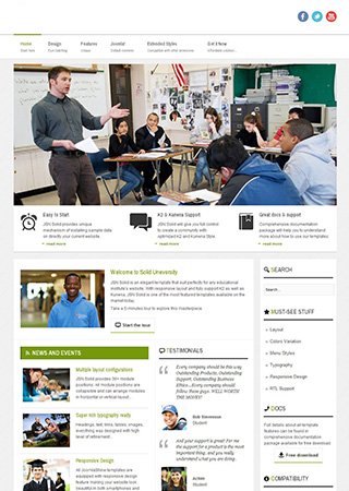
Below is a small selection of recent design projects for clients, we have 100’s of design ideas you could choose from and we can adapt. Some people have a design idea they have seen somewhere on the web, or features like a special type of photo gallery – customer survey forms – newsletter campaigns which you would like added to your site.


